Nike's Internal Search Tool
Background
While working at Nike we were having endless amounts of help tickets coming into our group regarding our merchandising tool and it was overwhelming our team. I took some time to analyze the tickets and bucket them into specific categories. It became obvious that many of the tickets could have been solved by the ender users if they used one of the internal tools called the "Ref App" which they had been trained on.
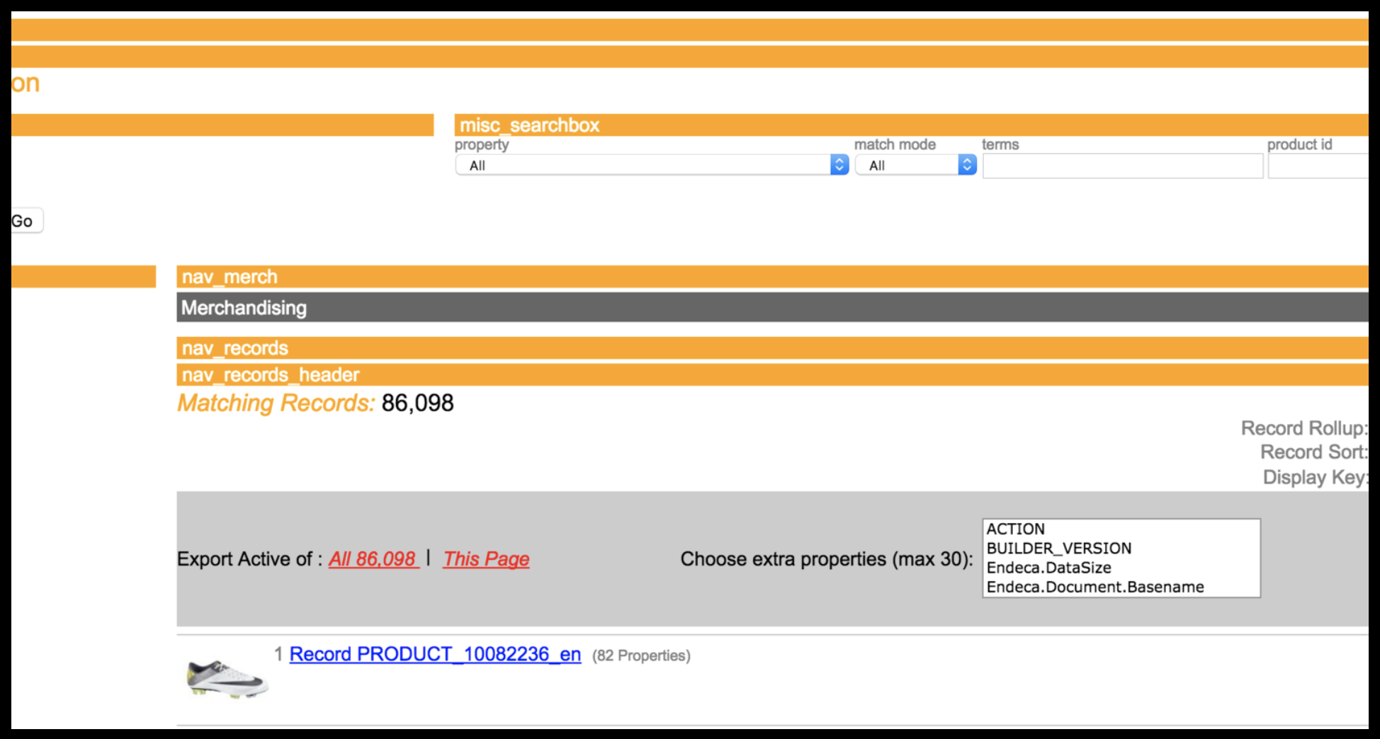
Ref App
I asked myself, "why weren't they using it?" so I decided to find out for myself.
Research
I decided to break down the Ref App from a UI perspective because it was obvious that the application was not user-friendly. But why?

The Problem
Working through the problem of why the tool was not being used.
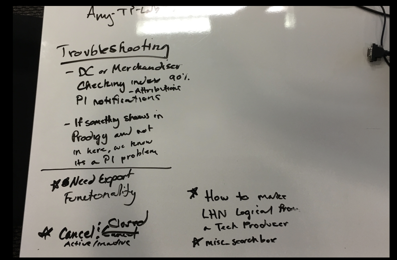
I worked with my manager to find out two things:
- Who the Ref App was built for?
- Who would benefit from using the Ref App?
After figuring out the potential users, I set up a focus group with all of them and had discussion regarding who currently used it, why people weren't using it, and how the application could improve their jobs.
I followed up with the few users who were actually using it and conducted 1:1 interviews to figure out the typical tasks they used in the application and what we could do to improve it.
User Research
Notes from the focus group of end users
The main issues were:
- Poor Layout (Gestalt Principle)
- Overly Technical Language for Labels
- Poor Interaction Design for the Selection Process
Result
Sadly, this work got pushed back in our backlog due to higher priorities (that dramatically increased revenue). However, getting the developers the user feedback improved future work on other projects and it shed light on how difficult the design (or lack thereof) made the work for our end users.